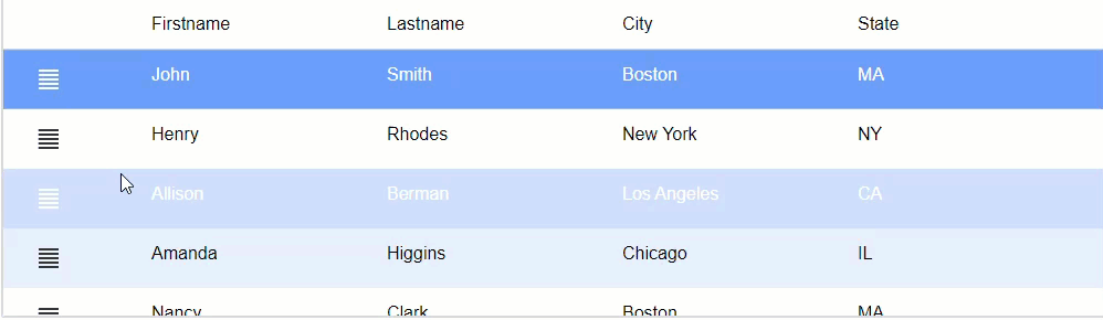
Two-state Static Images
Description
Static images in a List can be configured as two-state images, which display a different image based on the static image's toggled state: on or off.
Discussion
Animation effects can help users follow an application's flow. For example, rotating an arrow to point down when a content area expands or changing an image from a 'hamburger' icon to an 'X' when displaying a dropdown menu. Static images in the List can be configured as "Two-state Images". A two-state image is an image where the image that is shown is rotated or swapped for another image when the image is clicked.
To add a two-state image to a List:
Open the List Builder
On the Fields tab, click the Add Item button and then select the Static Image menu item.
Set the Image name. This is the image shown for the initial state.
Check the Two-state image property.
Optionally, specify the Swapped image name. If you do not specify a different swapped image, then you should specify a Rotation direction value other than none so that the displayed image changes when the image state is toggled.
Specify if the image should change state when clicked by setting the Toggle on click property. If you do not check this property, the image state can only be changed programmatically by calling the <listObject>.twoStateImageSet() method.
Specify the Rotation direction. The 90 and 180 options rotate in a clockwise direction. The -90 and -180 options rotate in a counter-clockwise direction.
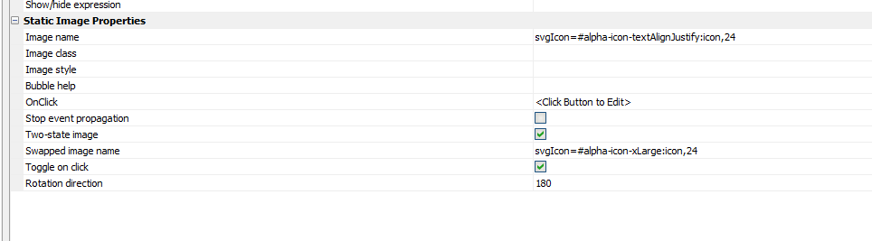
You can add custom JavaScript to the OnClick event to trigger an event when the two-state image is toggled, such as opening a dropdown menu. The OnClick event can be used to programmatically toggle the two-state image if you've unchecked Toggle on click.
Videos
Two-state images
A common design pattern when building user interfaces is to add icons that change with animation when the icon is clicked. For example, you might have a 'hamburger' icon that displays a menu. When the icon is clicked, you might want the icon to animate into an different icon (i.e. an 'X' icon) to indicate clicking the icon closes the menu.
In this video, we show how to create animated two-state images in a List.
See Also